Revamping Girlstart to streamline navigation and efficiency
Revamping Girlstart to streamline navigation and efficiency
Revamping Girlstart to streamline navigation and efficiency


ROLE
ROLE
UX Design Intern
UX Design Intern
TIMELINE
TIMELINE
September - December 2024
(10 weeks)
September - December 2024
(10 weeks)
MENTORS
MENTORS
Kyla Kalugdan
Sarah Guenther-Moore
Kyla Kalugdan
Sarah Guenther-Moore
METHODS
METHODS
User Research,
User Interviews,
Information Architecture,
Prototyping
User Research,
User Interviews,
Information Architecture,
Prototyping
BACKGROUND
BACKGROUND
Girlstart is a nonprofit organization empowering young girls in STEM
Girlstart is a nonprofit organization empowering young girls in STEM
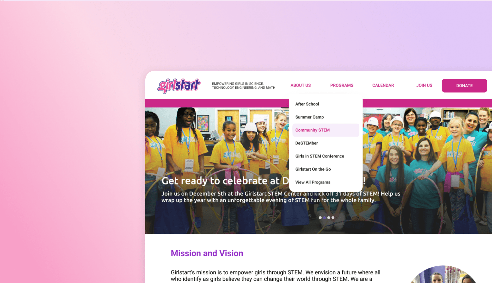
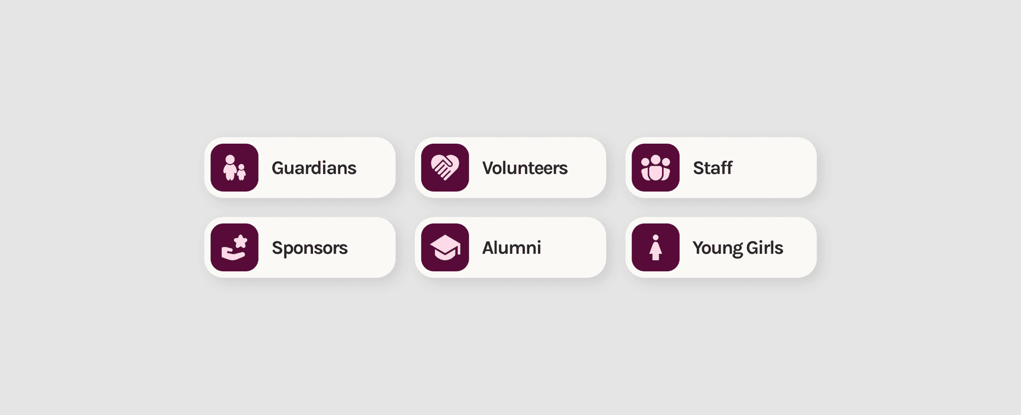
I had the opportunity to independently redesign Girlstart’s website under the guidance of my supervisors. With decades-old designs in need of purposeful updates, the challenge was to address the pain points of six main user groups with distinct needs.
I had the opportunity to independently redesign Girlstart’s website under the guidance of my supervisors. With decades-old designs in need of purposeful updates, the challenge was to address the pain points of six main user groups with distinct needs.


PROBLEM
PROBLEM
Users have difficulty navigating through the website
Users have difficulty navigating through the website
Google surveys with 68 users helped me understand that users feel frustrated completing their desired task — taking longer than it should be.
Google surveys with 68 users helped me understand that users feel frustrated completing their desired task — taking longer than it should be.
20/68 users felt some pages were too cluttered and overall design looked outdated.
20/68 users felt some pages were too cluttered and overall design looked outdated.
31/68 users disliked the website’s organization and struggled with information overload.
31/68 users disliked the website’s organization and struggled with information overload.
USER RESEARCH
USER RESEARCH
Digging deeper into user friction and their frustrations
Digging deeper into user friction and their frustrations
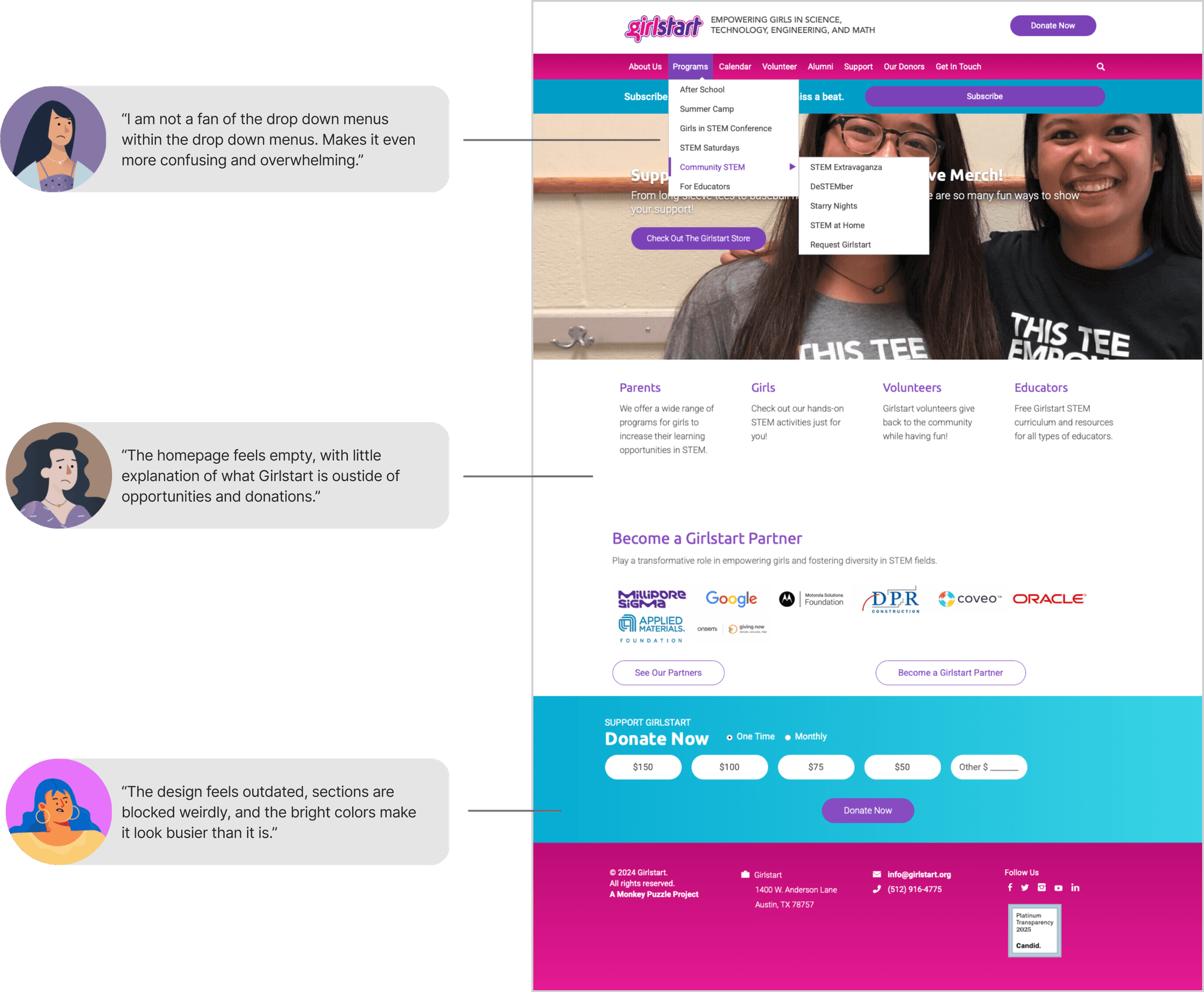
I conducted five user interviews to uncover specific pain points within the website, which guided my design decisions and ensured they remained user-centered. Users often got stuck at the homepage and website assets.
I conducted five user interviews to uncover specific pain points within the website, which guided my design decisions and ensured they remained user-centered. Users often got stuck at the homepage and website assets.


INFORMATION ARCHITECTURE
INFORMATION ARCHITECTURE
Rebuilding the organizational foundation for greater clarity
Rebuilding the organizational foundation for greater clarity
Based on user research insights, I restructured the website's information architecture from the ground up. Applying the five-tab navigation principle, I reorganized and regrouped pages into a streamlined hierarchy.
Based on user research insights, I restructured the website's information architecture from the ground up. Applying the five-tab navigation principle, I reorganized and regrouped pages into a streamlined hierarchy.


USER TESTING
USER TESTING
Following the clicks: Testing how users find their way
Following the clicks: Testing how users find their way
I noticed some pages could fall under multiple categories. To better understand user’s thought process, I ran user testing to see where users naturally went first.
I noticed some pages could fall under multiple categories. To better understand user’s thought process, I ran user testing to see where users naturally went first.
4/4 users prefer volunteer page in join us tab
4/4 users prefer volunteer page in join us tab
4/4 users prefer alumni page in about us tab
4/4 users prefer alumni page in about us tab
3/4 users prefer employment page in join us tab
3/4 users prefer employment page in join us tab
4/4 users struggled to find the support page
4/4 users struggled to find the support page
USER TESTING INSIGHTS
USER TESTING INSIGHTS
Thinking beyond the designer's lens
Thinking beyond the designer's lens
The best way to clear up uncertainty is by going straight to the users. Watching how users navigated not only helped me finalize the placement of those tricky pages, but also revealed critique I hadn’t considered. Here’s what I learned:
The best way to clear up uncertainty is by going straight to the users. Watching how users navigated not only helped me finalize the placement of those tricky pages, but also revealed critique I hadn’t considered. Here’s what I learned:
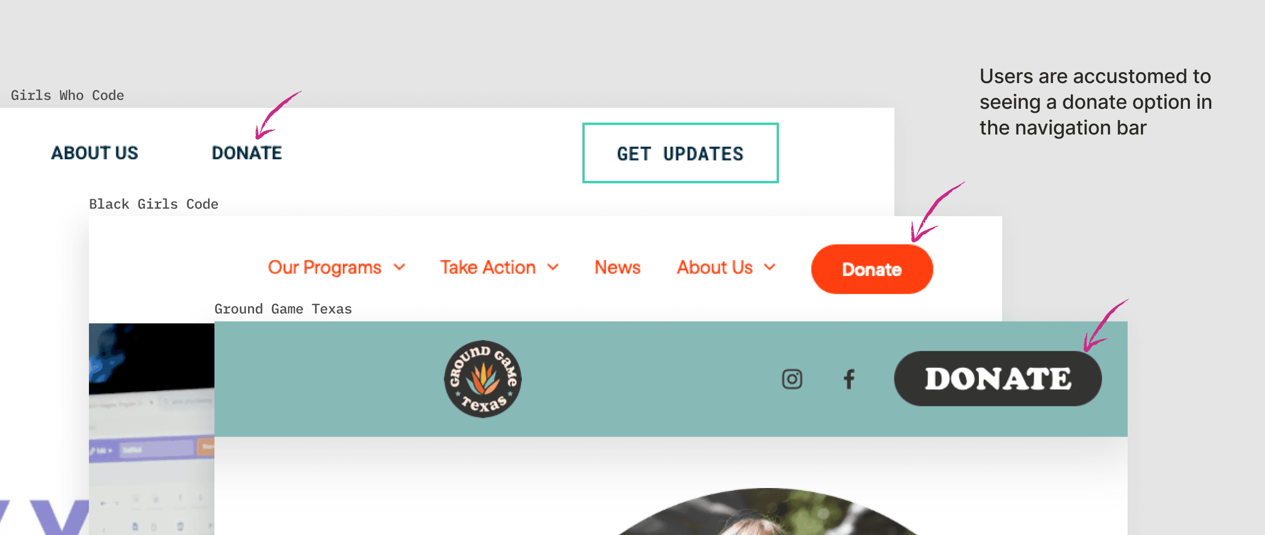


Keep in mind best practices from other nonprofit websites
Keep in mind best practices from other nonprofit websites
I experimented converting the donate button into a combined support page. However, users preferred keeping it as a dedicated donate button because of its familiarity.
I experimented converting the donate button into a combined support page. However, users preferred keeping it as a dedicated donate button because of its familiarity.
Clarify purpose before call for action
Clarify purpose before call for action
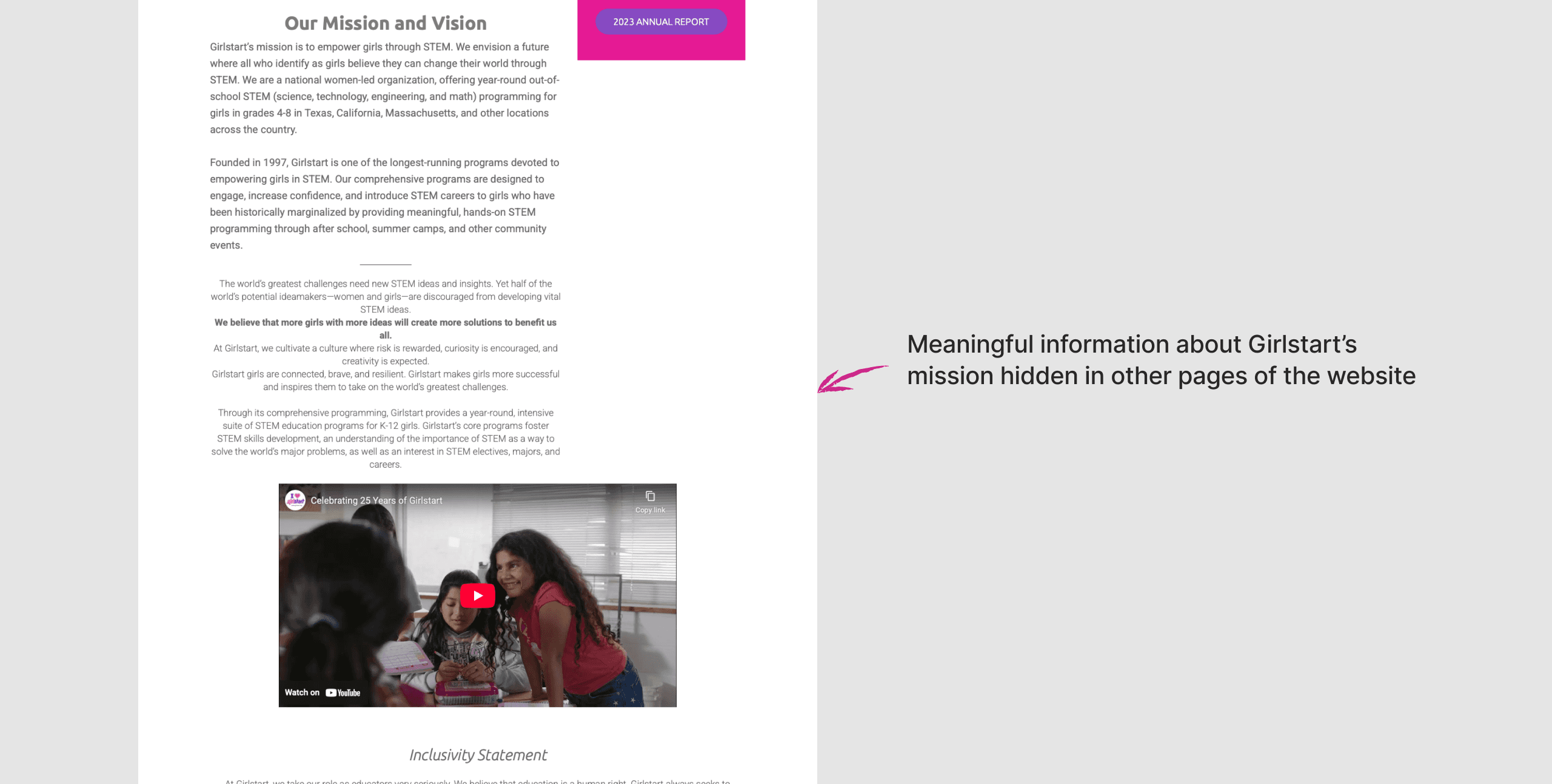
The homepage should meaningfully explain what Girlstart does before asking to “Donate.” Information about the organization was hidden in other pages, making the homepage feel disconnected.
The homepage should meaningfully explain what Girlstart does before asking to “Donate.” Information about the organization was hidden in other pages, making the homepage feel disconnected.


FINAL DESIGNS
FINAL DESIGNS
Designing a smoother experience so users can find what they need, faster
Designing a smoother experience so users can find what they need, faster
Homepage with purpose
Homepage with purpose
Homepage with purpose
Understand where your support goes and why it matters
Enhanced navigation bar
Enhanced navigation bar
Enhanced navigation bar
Simplified for straightforward access
Footer with purpose
Footer with purpose
Footer with purpose
Improved access points


New information architecture
New information architecture
New information architecture
Revised after user feedback


USER FEEDBACK
USER FEEDBACK
Users can now complete their task with more confidence
Users can now complete their task with more confidence
Based on a post-survey from our user interviews, results indicated overall improved user satisfaction and greater clarity when completing core tasks.
Based on a post-survey from our user interviews, results indicated overall improved user satisfaction and greater clarity when completing core tasks.
+50%
increase in task completion rates and user satisfaction
increase in task completion rates and user satisfaction
+75%
increase in navigation efficiency and faster decision making
increase in navigation efficiency and faster decision making
TAKEAWAYS
TAKEAWAYS
My key learnings as the solo designer
My key learnings as the solo designer
Dream big but design feasibly
Dream big but design feasibly
I intended to redesign Girlstart's full website but underestimated the scope. User research revealed foundational issues that needed fixing first, consuming more time than expected.
I intended to redesign Girlstart's full website but underestimated the scope. User research revealed foundational issues that needed fixing first, consuming more time than expected.
Be curious out loud
Be curious out loud
Mentors and senior professionals are there for a reason. Seeking guidance early has become essential to my growth and leads to better outcomes for everyone involved.
Mentors and senior professionals are there for a reason. Seeking guidance early has become essential to my growth and leads to better outcomes for everyone involved.
Like what you see? Check out more of my work :)
Like what you see? Check out more of my work :)
